DESIGNING A TRAUMA-INFORMED EMOTIONAL SUPPORT APP THAT HELPS WOMEN HEAL AFTER LEAVING ABUSE
Bloom
Personal Project
ROLE
UX/UI Design
YEAR
2025

01 DISCOVER
Clarifying the "why"
BACKGROUND
Why this matters is bigger than "wellness", it’s widespread, underreported and has long-term mental health impact.
In this project, I use survivor to describe a woman who has experienced domestic or intimate partner abuse and is now in the process of reclaiming control and healing. Survivor is often preferred because it emphasises resilience rather than suffering.
Bloom is designed specifically for survivors who have already left the abusive relationship and are navigating the emotional aftermath. Designing for individuals currently in an active abusive environment involves complex safety and risk constraints beyond the scope of my university project.
Bloom exists because survivors often struggle with emotional trauma, isolation and rebuilding self-worth after leaving, yet most digital tools stay focused on crisis response or generic mindfulness.
To ground the problem in evidence:
27%
of women aged 15–49 globally have experienced intimate partner violence.
50,000
women and girls were killed by intimate partners or family members in 2024.
7%
of high-risk survivors considered or attempted suicide as a result of abuse.
PROBLEM SPACE
Where do most apps unintentionally fail survivors?
Many wellness apps are built around consistency, progress tracking and "showing up every day". For someone healing after abuse, that default can backfire. When you’re dysregulated, hypervigilant or emotionally shut down, streaks, stats and prompts can feel like a performance test and missing a day can trigger guilt, shame or the sense that you’ve “failed” at healing.
The problem isn’t "lack of motivation", it’s that healing after abuse is non-linear.
Most tools assume users show up consistently. Survivors often can’t and that’s normal. In my research, I designed for reality: someone may engage deeply one day and withdraw the next due to overwhelm, shame or fear.
02 RESEARCH
The insights that guided the work
CORE FRAMEWORKS

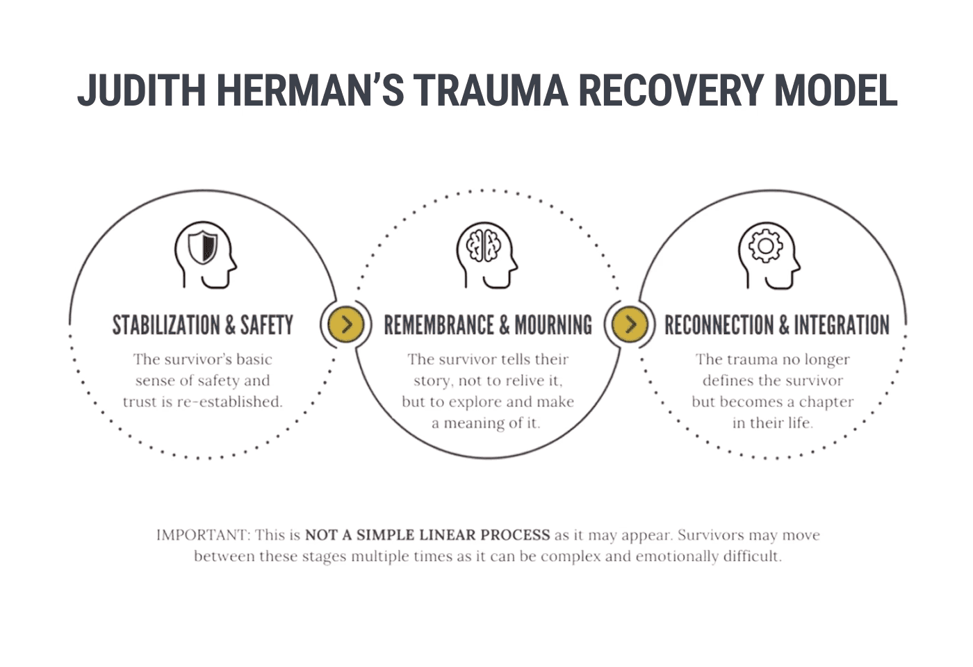

EXPERT-INFORMED REVIEW
Designing an emotional support tool for survivors can’t rely on intuition alone, it needs safeguarding and professional guidance. To validate my design direction, I focused my review on trauma-informed expert guidance. Since Bloom supports survivors in the recovery stage after leaving, the focus wasn’t crisis escape design it was on post-trauma recovery needs nervous-system safety, autonomy and private-by-default support that makes returning feel safe.
Here are my insights…
THEMATIC ANALYSIS
Then I used secondary research instead of interviews to protect a vulnerable group and strengthened credibility with triangulated evidence.
Instead of treating research as a checkbox, I treated ethics as a constraint and designed within it.
Because interviewing survivors of domestic abuse carries ethical risk, I relied on public, anonymised survivor and victim narratives (Reddit communities, blogs, podcasts, vlogs) and validated patterns through published reports and datasets to build a trauma-informed understanding of needs without using identifying information.
So what did the narratives consistently reveal?
Across survivor and victim narratives, five patterns kept repeating: emotional isolation, overwhelm & hypervigilance, fear of judgement, a need for control and fractured self-worth. A key finding was that healing is non-linear, users may engage deeply one day and disappear the next so any "consistency = progress" mechanic risks shame.
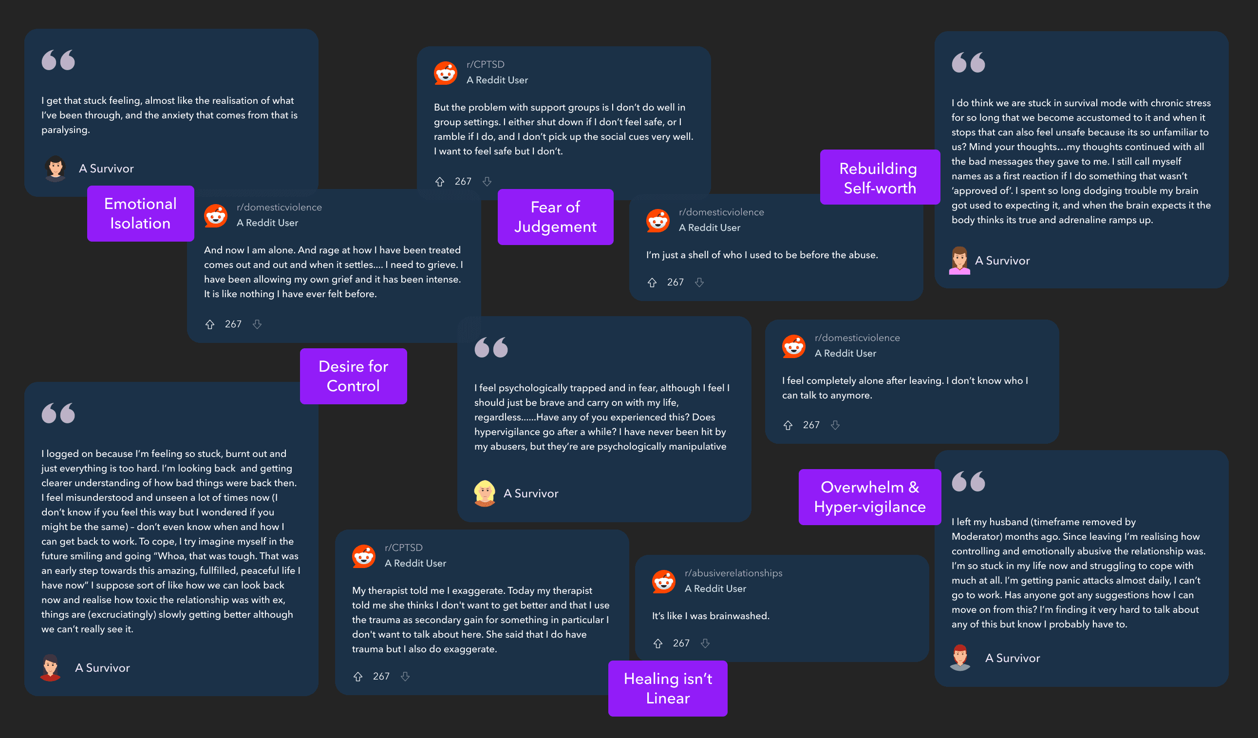
From my thematic analysis of narratives, I translated the recurring emotional themes into a specific design response.
I ensured every UI decision was directly grounded in user evidence rather than assumptions, prioritising safety, autonomy and gentle re-entry. Each theme from my thematic analysis was mapped into feature-level UX requirements directly shaping Bloom’s structure, tone, language and pacing.
HYPOTHESIS
03 EMPATHISE
Understanding the users
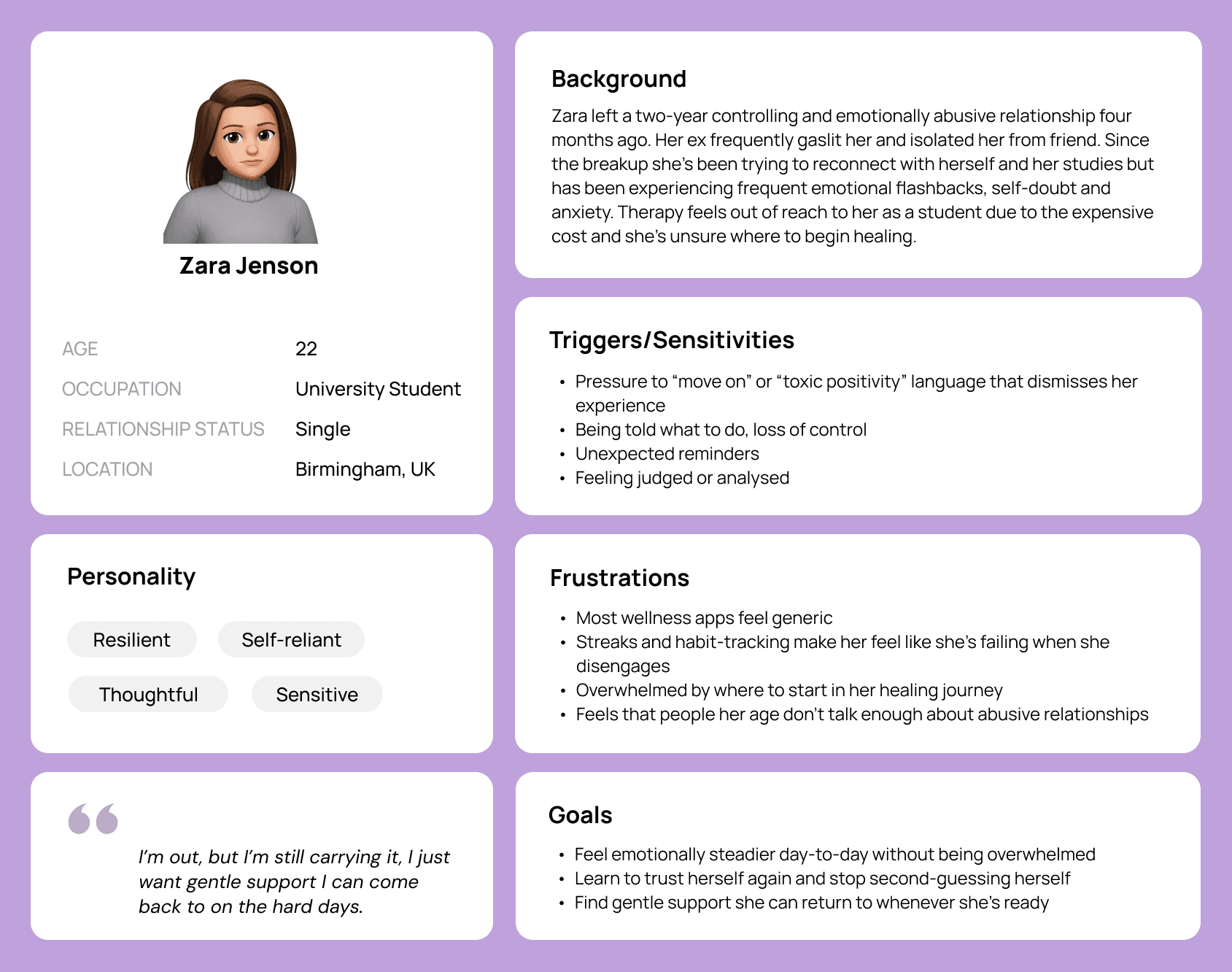
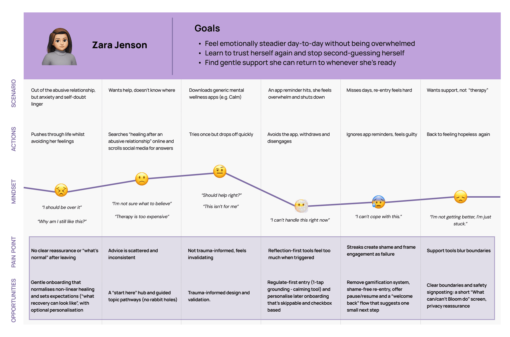
USER PERSONA & JOURNEY MAP
Drawing on my research findings, I created Zara’s persona and journey map to capture the emotional reality of post-abuse recovery and highlight where current tools fail to meet survivors’ needs.
04 IDEATE
Designing possible paths
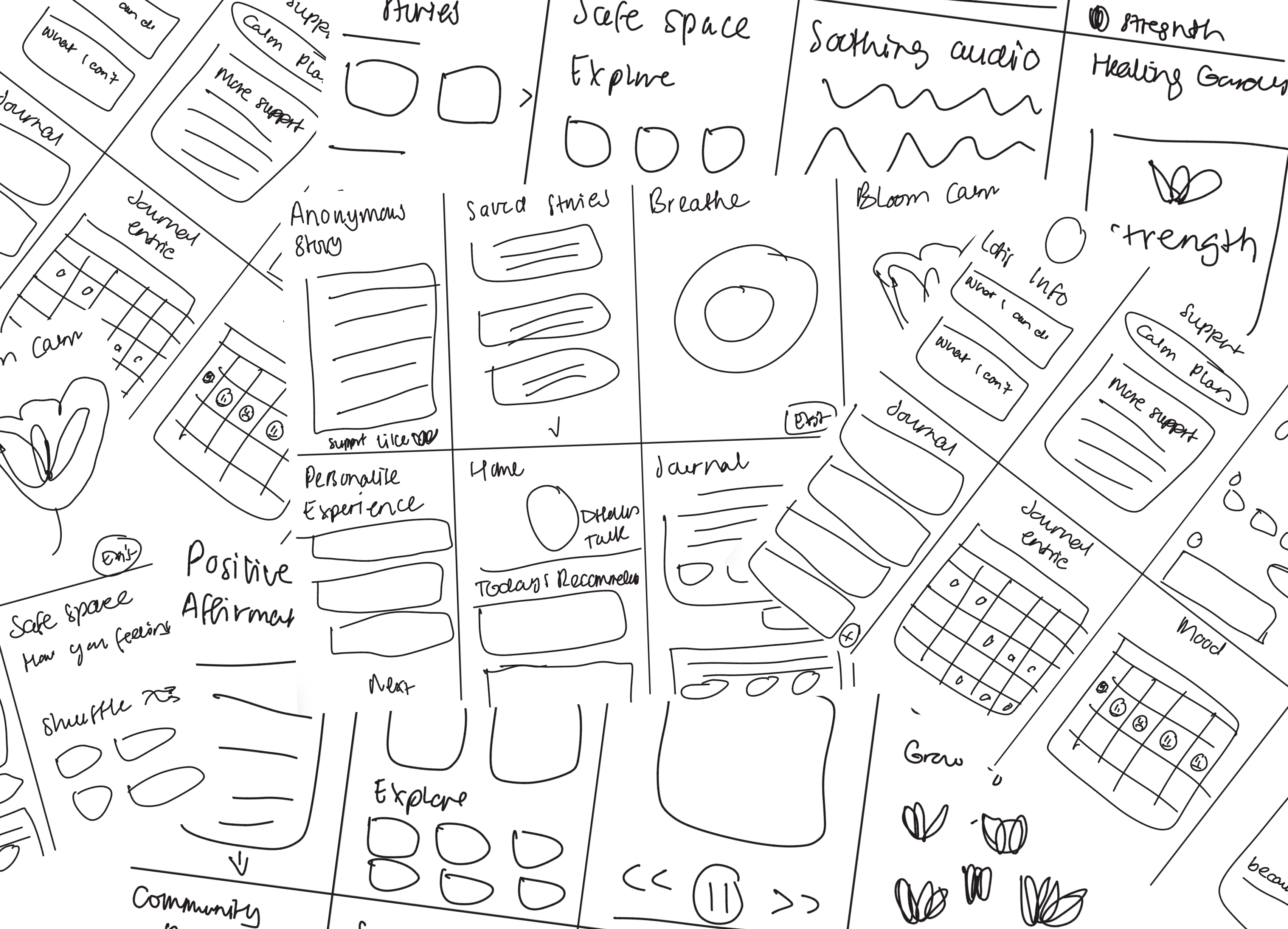
CRAZY 8S
I used the Crazy 8s ideation sprint to generating quick, low-fidelity variations of key screens, exploring multiple ways Bloom could support survivors without increasing pressure. This helped me test different interaction patterns and identify the directions that felt most calm, optional, and safe to engage with.
INFORMATION ARCHITECURE
Based on my research insights, I translated survivors' key needs: safety, autonomy and low-pressure support into a trauma-informed user flow that structures Bloom around gentle entry points, clear boundaries and choice-led navigation.

BRAND IDENTITY
Rooted in the phrase “No mud, no lotus.” (Thích Nhất Hạnh), the idea that beauty and healing are born through struggle - without pain, there is no growth (Roizen, 2021).
Just as the lotus rises from deep, muddy waters to bloom in the light, survivors emerge from abuse with strength and resilience. For women recovering from abuse, the lotus honours their courage and acknowledges the profound strength it takes to rise through it.
Meet Lotis, designed for safety, choice and trust

Insights from my research highlighted three needs: emotional safety, consistency and non-judgement. Lotis was designed to meet those needs as a calm, always-available companion that users can approach on their own terms. It supports regulation through quick grounding prompts, normalises setbacks with compassionate language and invites reflection through optional journaling prompts.
Lotis is framed as support, not a replacement for professional care. It doesn’t provide therapy, diagnosis or treatment.
05 PROTOTYPE
Bringing ideas to life
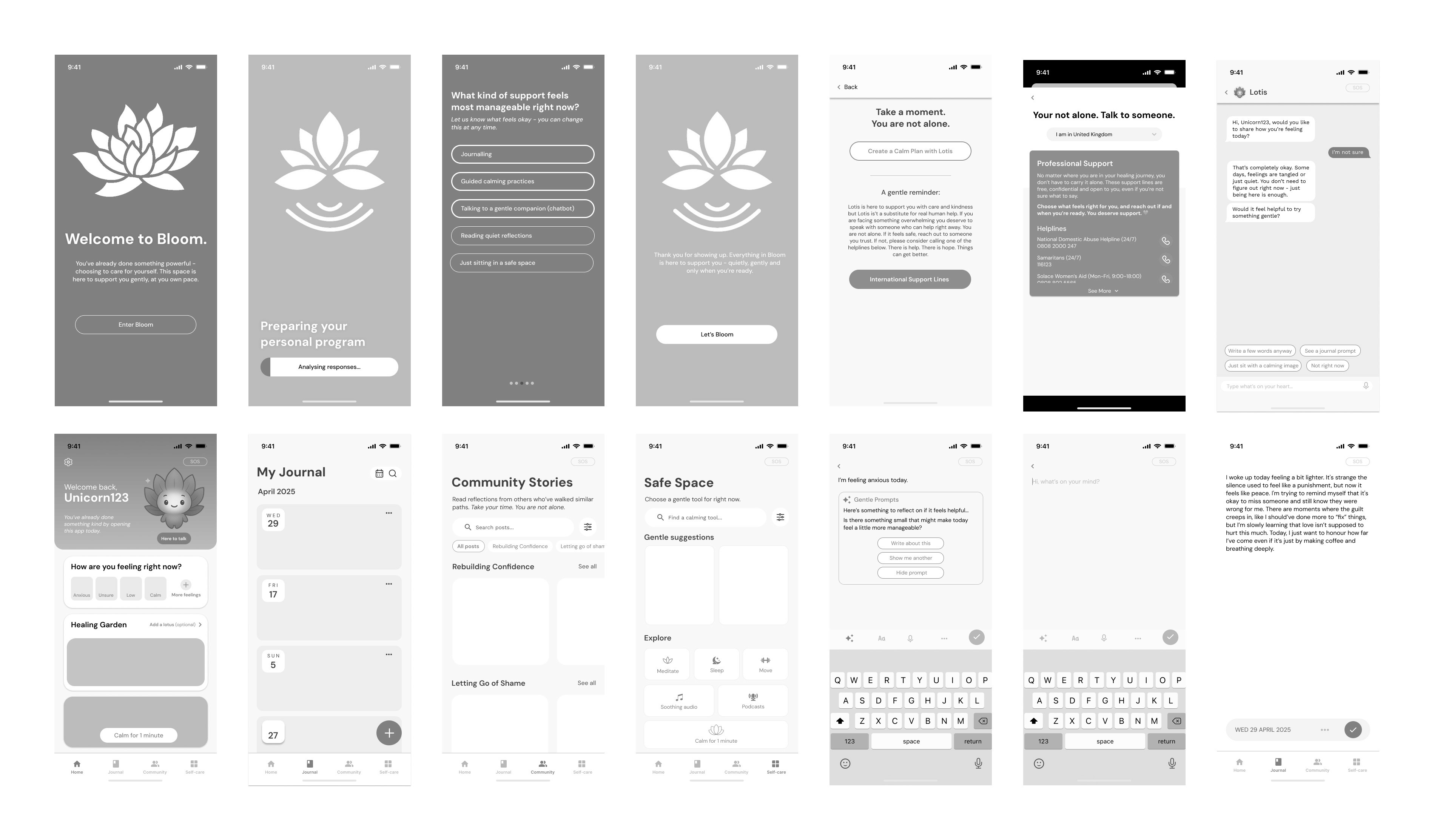
PROTOTYPE
I created a set of low-fidelity prototypes to compare alternative UI structures and prioritise the most trauma-informed, least overwhelming option.
USABILITY TESTING
I conducted a usability test with five participants to evaluate clarity, navigation and emotional safety across key flows. Due to ethical considerations, I did not test with survivors directly, instead this round was used to validate general usability and identify potential points of confusion or overwhelm.
Participants: 5
Format: moderated tasks & think aloud
Focus: clarity, navigation, emotional safety
Needs improvement
Pain Points
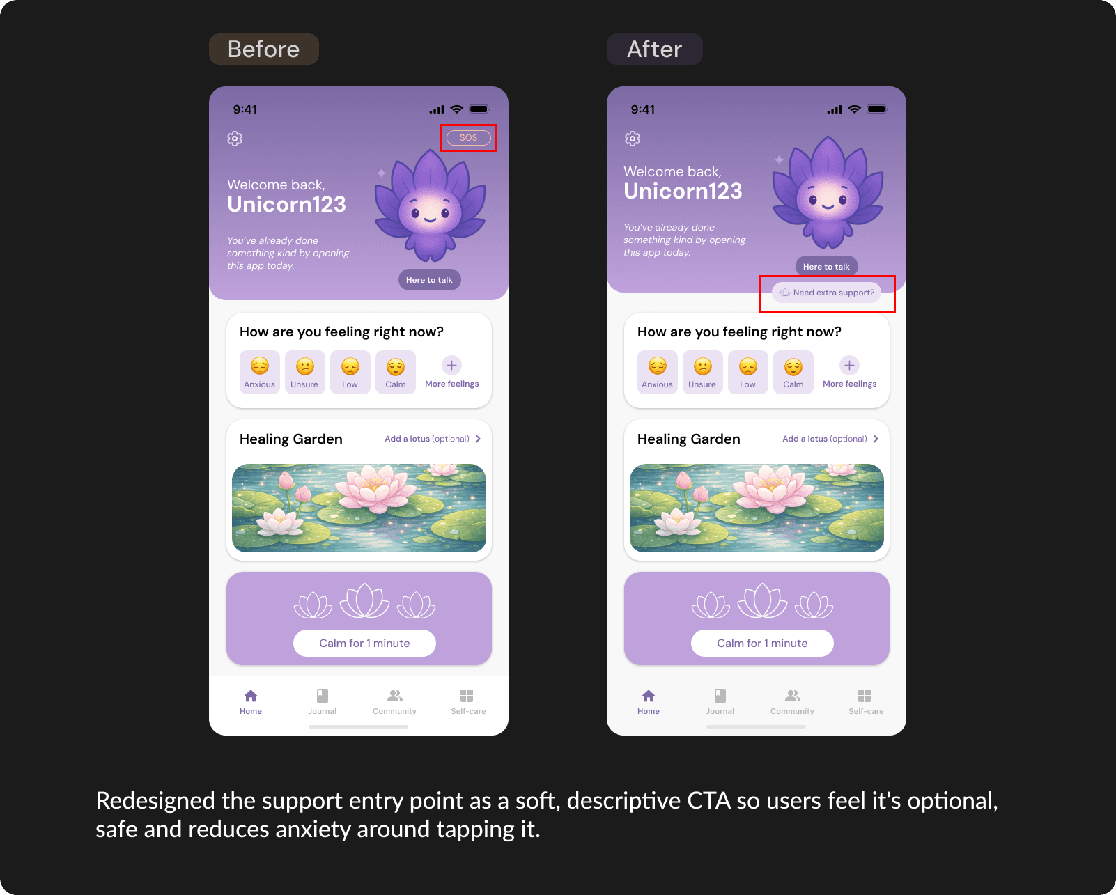
Support button: users either missed it or feared tapping it by accident
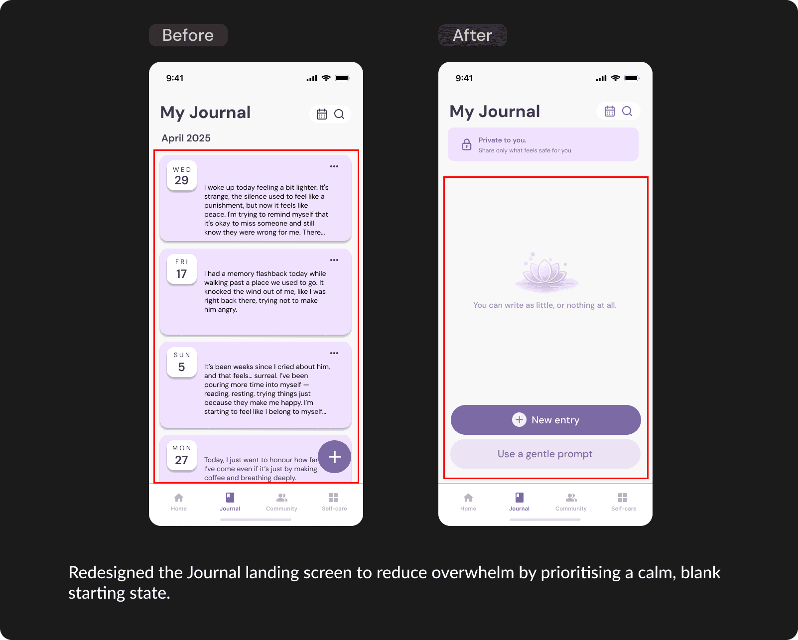
Users felt overwhelmed by seeing lots of past text entries at once on the Journal landing screen.
Users felt unsure about privacy (especially for journal and community)
What worked
Positive Feedback
The tone feels calming and non-judgemental.
Users liked that they don''t feel pressured to do a task.
Lotis' prompts felt supportive and easy to respond to, especially the quick options.
The mood check-in is quick and doesn't feel like a test. Feels more gentle than typing when overwhelmed.
IMPLEMENTING FEEDBACK

HIGH FIDELITY DESIGN

A gently entry to support, safety and self-regulation
A calm hub that helps users orient, check in and choose one small next step without pressure.
Private reflection, simplified
Start a new entry or choose an optional gentle prompt to help you reflect safely and at your own pace.
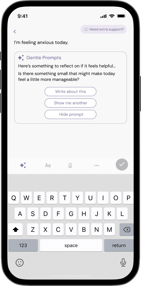

Supportive conversation, not therapy
Lotis is a gentle support companion that validates how you feel and offers grounding or optional prompts without acting like a therapist. You stay in control, you can pause or skip at any time and Lotis can point you to further support if you need it.
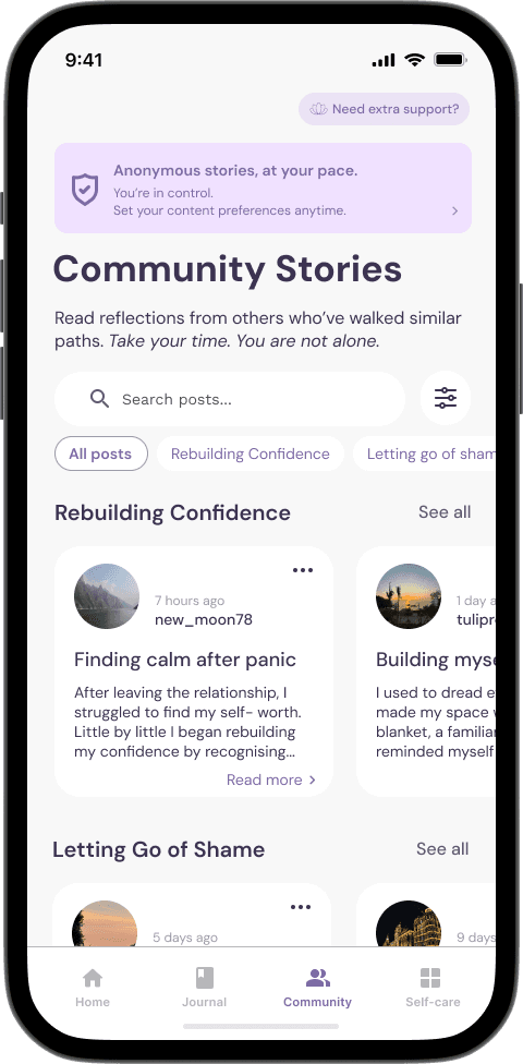
Peer reassurance, on your terms
A calm, anonymous space where you can read moderated reflections and feel less alone, without needing to post or interact. You can adjust content preferences anytime, so you stay in control of what you see.
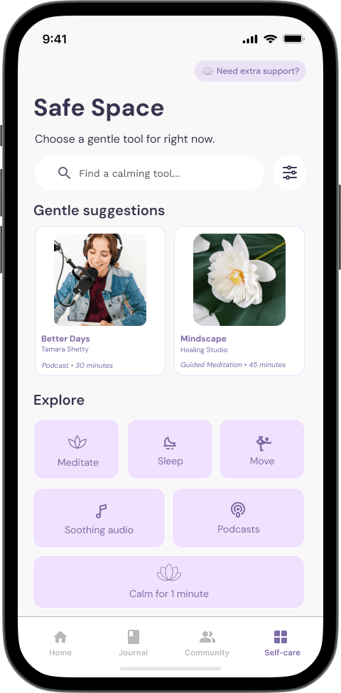
Choose a gentle tool for now
A curated self-care space designed to help users regulate in the moment through low-effort, trauma-informed tools. Choose a gentle suggestion or use search and explore to find what fits your energy right now.
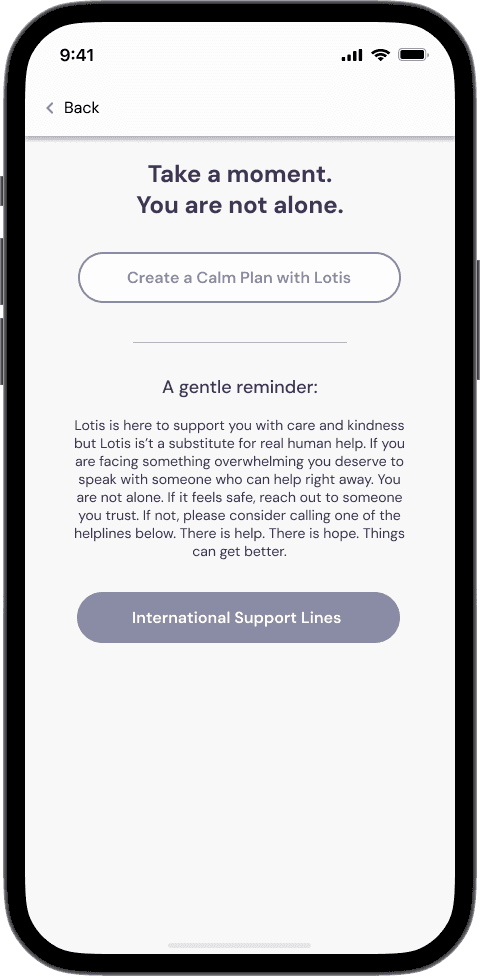
Support, at your pace
An always-available support entry designed to feel safe to tap. Users can self-soothe with Lotis or connect to helplines in a single step.
06 REFLECTION
Improving through iteration
REFLECTION
What I Learned
01
Reduce pressure, increase choice
Bloom is built around low-pressure interactions, optional prompts, “not ready” exits and calm language to support non-linear healing without guilt, streaks or performance. Designing for survivors reinforced that emotional safety comes from giving users control over pace, depth and engagement.
02
Privacy has to be visible to feel real
I learned that trust is strengthened when privacy is communicated directly in the interface, not hidden in settings. By adding clear privacy cues (e.g., “Private to you”) and surfacing content controls where users need them most (Journal and Community), Bloom feels safer, clearer and more reassuring to use.
03
A support chatbot needs clear boundaries to stay safe
Lotis was designed as a trauma-informed companion, not a therapist, using non-directive, validating language and choice-based prompts. This confirmed how important boundaries are for harm reduction: Bloom supports emotional regulation and reflection while avoiding diagnosis, pressure or intrusive questioning.
Next Steps
01
Validate trauma-informed safety with expert review
Get practitioner input from domestic abuse services to confirm Bloom’s language and boundaries are consistently trauma-informed. This helps ensure prompts remain supportive in high-stress moments and that escalation routes are clear, appropriate and easy to access for users.
02
Enhance accessibility through a low-stimulation Quiet Mode
Bloom already uses a calm, minimal visual style, but in moments of overwhelm some users may still need an even quieter interface. As a next step, I’ll explore an optional Quiet Mode that further reduces visual and cognitive load, helping users stay oriented and access support with less effort when their capacity is low.